Business Context
BeZero Carbon rates carbon credit projects. Its platform holds thousands of rated projects, a screening tool, research insights and market data. Most users are analysts and investors in carbon markets, and for them fast, accurate access to project data matters more than anything else.
The AI assistant was a significant internal investment, built to help users navigate the platform and surface insights. Getting users to actually use it was a business priority. The dashboard was meant to make all of this discoverable, but it wasn't working.
| Page | Events | Clicks |
|---|---|---|
| Project list & project pages | 79.2K | 79.2K |
| Scorecards | 24.7K | 24.7K |
| Homepage | 15.4K | 15.4K |
| Not defined | 12.5K | 12.5K |
| Account management page | 6.8K | 6.8K |
| Project – overview | 6.2K | 6.2K |
| Insights – article | 2.7K | 2.7K |
| Project – insights | 2.2K | 2.2K |
| AI assistant→ View | 988 | 988 |
| Search results | 867 | 867 |
Impact
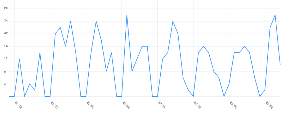
After the redesign launched in January 2026, the average number of daily users engaging with the AI assistant rose from two or three to around 21. 15% more users reached projects directly through the assistant. Users also spent twice as long in conversation with it, which suggested they trusted it enough to go deeper. These numbers have held steady since launch.
The dashboard went from a page users skipped to one that routes them towards the work they came to do.
The Problem
The dashboard had been running largely unchanged since 2023. It was built under stakeholder pressure with no usage data to justify its hierarchy. Insights sat at the top, which never felt right to me. My instinct from day one was that users came for projects and ratings data rather than editorial content. Without evidence, that stayed an instinct.
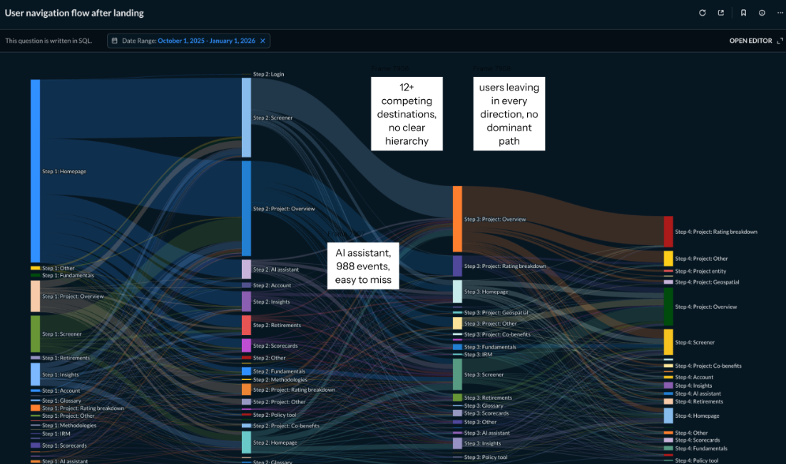
FullStory, a session analytics tool, eventually made the case. Users landed, ignored most of the page and navigated away within seconds. Project list and project pages generated 79,200 events, while the AI assistant generated 988. At one point we stopped routing users to the dashboard and sent them straight to the project page instead, which only confirmed what the data showed. Users arrived with a goal and the dashboard wasn't helping them reach it.
The AI assistant had its own problem. Technically it worked well, with accurate answers and reliable data. But it lived on a separate page most users never found, and the users who did find it weren't using it the way it was designed.
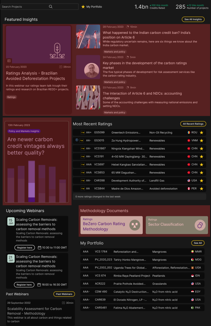
The fold cut through the middle of the articles. Users who didn't scroll saw only editorial content, with no visible path to the projects or ratings data they came for. The only editorial content that got clicks was the methodology documents.
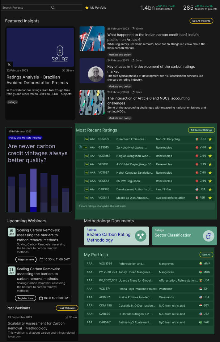
My Portfolio, the only content users had curated for themselves, sat at the very bottom of the page below everything the platform had pushed at them.
Using AI Logs as User Research
Click data shows what people do. The assistant's query logs showed me what they were trying to do. These logs live in LangFuse, an AI observability tool that records every question users ask and every answer the assistant gives.
I treated the logs as an unfiltered record of user intent. When someone types into an AI assistant they aren't choosing from options or navigating an interface. They describe what they came to do in their own words.
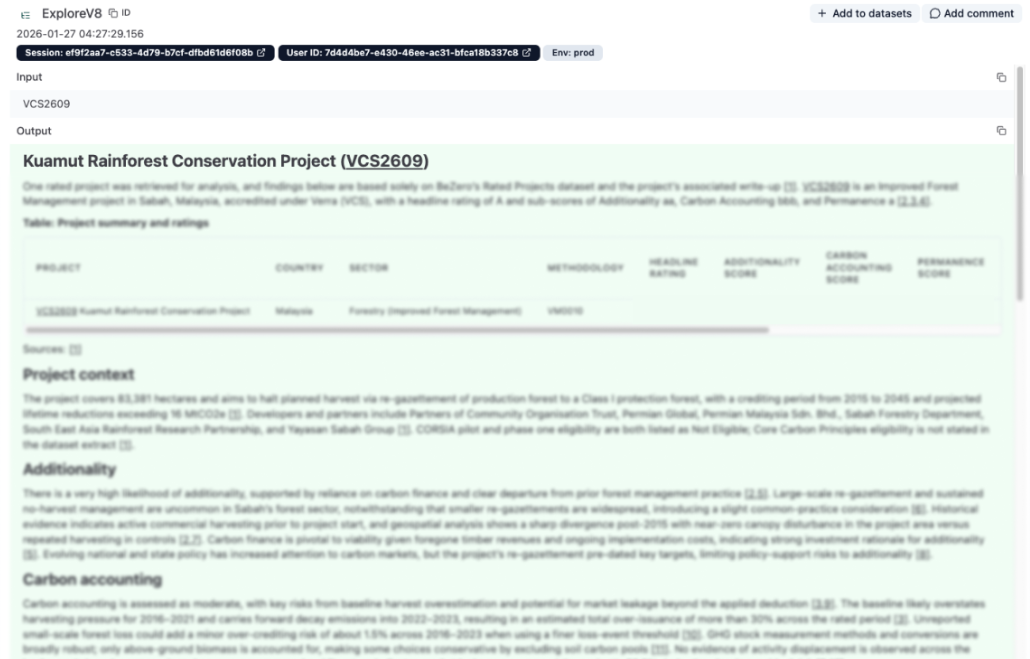
What I found reframed the problem. Users weren't asking the assistant to analyse or summarise anything. They were typing project names and filter criteria because they were trying to find things. That wasn't a failure of the assistant. It showed that the platform's navigation was too slow, so users were trying to shortcut it through the assistant.
Evaluating the Assistant
Before recommending a more prominent position for the assistant, I needed to know whether it was good enough to deserve one. Giving a weak tool more visibility would have made things worse.
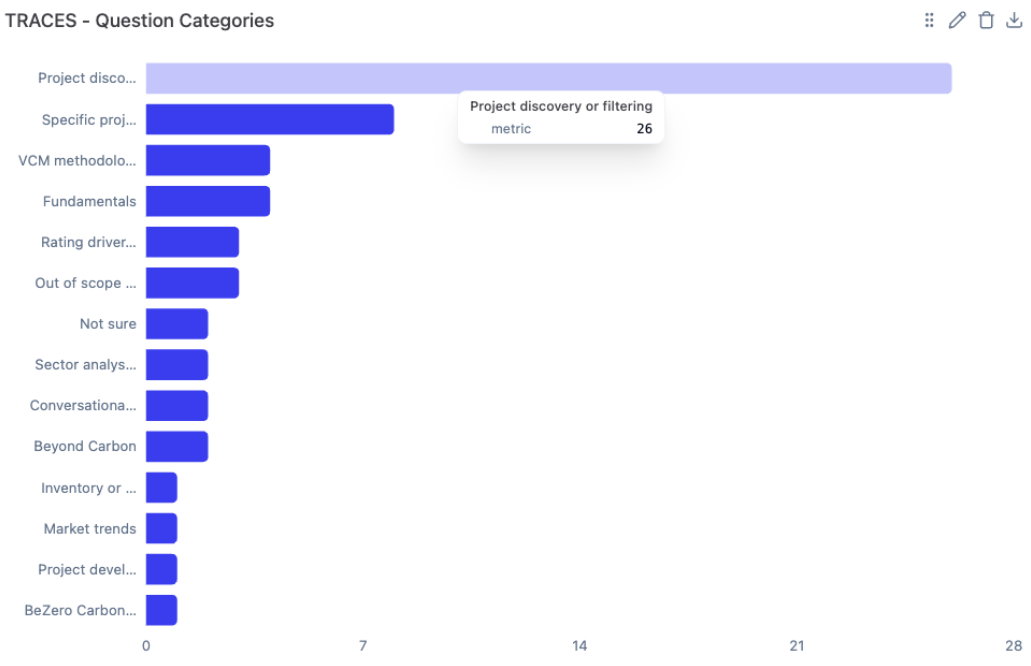
I worked through the queries in LangFuse one by one and categorised each by intent. Was the user trying to reach a project page? Were they using the assistant instead of search? Were they trying to understand BeZero's methodology or ratings? That taxonomy showed what users needed the tool to do compared with what it was designed to do.
The most important finding was a consistent confusion between search and AI. Users typed project names expecting to land on a project page. The assistant treated those queries as conversational prompts and returned explanations instead. Users wanted to navigate and got an answer they hadn't asked for, and that mismatch caused them to abandon the assistant.
That finding led directly to a product change. We built a feature so that when a user types a project name, the assistant shows a direct link to that project page while the AI response loads. The assistant now handles both jobs at once rather than forcing users to choose.
Analytics alone would never have shown this. The logs showed what users expected as well as what they did, and where the gap between the two was costing us.
Key Insights
Users arrived with a specific goal. 97% of users moving from the dashboard to a project overview did it through search. Around half knew exactly what they wanted and went straight for it. The rest were filtering, trying both methods or scrolling when their first approach failed.
The assistant's problem was discoverability, not capability. Users weren't avoiding it out of preference. They left the dashboard to find a project first and never came back to the assistant.
The dashboard and the assistant were competing. Both were trying to be the entry point and neither was doing it well. The problem was the structure of the platform rather than either feature on its own.
Reframing the Brief
The brief was a single ticket: "freshen up the AI page." There was no mandate for a structural change. The assistant had significant internal investment behind it, so any solution needed to visibly move it forward. I was also working within an existing design system and engineering roadmap, so the solution had to be achievable as well as right.
I reframed the brief. If users arrived with one job, finding and evaluating projects, then the dashboard's job was to help them do that as quickly as possible. The assistant wasn't competing with that goal. Positioned correctly, it was the best tool for it.
The strategy was to merge the dashboard and the assistant into a single entry point built around intent. Search would become the main interaction, with the AI integrated directly into it. Everything users actually needed would sit above the fold. The rest of the platform would be reachable through navigation and quick links rather than placed on the page all at once.
Iterations
The first direction improved the assistant's interface on its own, using patterns from conversational tools users already understood. It was useful groundwork, but a better looking assistant on a separate page would still be a page most users never reached.
The second direction brought the assistant onto the dashboard but kept the existing structure around it. This exposed the core tension. The hierarchy was so driven by stakeholders that adding the assistant just created another competing module.
The third direction was the structural fix. I removed the competing modules and centred the layout on search with the AI built into it. The screener, recent ratings and project quick links moved above the fold, based on what the navigation data showed users were trying to reach.
Explore Our Carbon Ratings
Validation
In November 2025 we ran an experiment that sent users straight to the assistant page, to test whether discoverability alone was the issue. Only 10% asked a question, against a target of 20%. The behaviour was more revealing than the number. Most users navigated away to find a project first and came back to the assistant later. Nobody new engaged because of the experiment.
Discoverability was part of the problem but not all of it. The assistant needed to sit in context rather than wait on a page of its own.
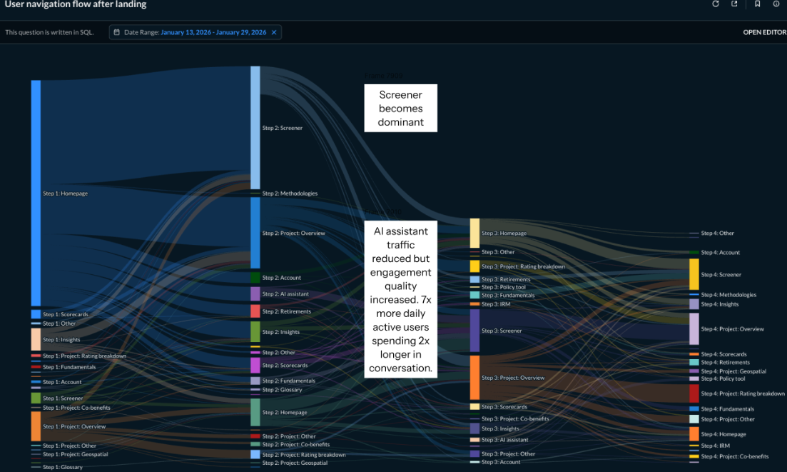
After the redesign launched in mid-January 2026, daily active users on the assistant averaged 21. The worst days after the redesign outperformed the best days before it. The navigation flow diagrams show the assistant receiving less raw traffic after the redesign, and that's expected. The November experiment had inflated those numbers by forcing users onto the assistant page. After the redesign, users reached the assistant intentionally and in context, which is why conversations doubled in length and daily users rose sevenfold.
Outcomes
The dashboard now works as what it should always have been, a routing layer that respects what users came to do. The assistant finally has a home that makes sense, embedded in context rather than isolated on its own page.
For the business, the redesign advanced two goals that had previously felt like competing priorities. Project discovery improved and AI assistant engagement rose significantly.
The brief was to freshen up a page. The real work was two years of watching a problem grow, building the evidence to name it and making the case to fix the right thing when the opportunity came.
What's Next
Search solved the immediate discovery problem, but it showed how heavily users rely on it. Future work should explore better browse and filter paths, so users don't need to know exactly what they're looking for before they start.
LangFuse still shows users asking questions the assistant struggles to answer quickly. Better response quality and speed would encourage deeper analytical use rather than simple navigation queries, which is where the tool's real value sits.
Many users repeatedly search for the same projects or sectors. A future version could surface personalised shortcuts based on recent activity, so returning users wouldn't need to search at all.